
Freetime is a time tracker for freelancers who hate the hassle of time tracking
Freetime is an end-to-end MVP for a mobile iOS app that helps freelancers keep track of their time for billing and building their business.
iOS app
productivity
ROLE
Research, interaction design, visual design
TOOLS
Figma, Figjam, Miro, Google Workspace, Zoom, Fathom AI
when
Sep to Nov 2023
CONTEXT
Time tracking is an essential part of the freelancer workflow. Freelancers keep track of their time so that they can bill for their client work and get paid. It also allow freelancers to understand how long a specific project or task takes, which helps with project planning.
problem
Freelancers are running their own business while jumping between projects, multitasking, or deeply immersed in flow states. Having to time track is an inconvenient and tedious hassle to an already busy and demanding workflow.
solution
A mobile iOS application that removes the pressure and guesswork from time tracking by:
Passively time tracking as you jump between tasks
Giving project insights that give you a peak into your billable and non billable time
research
How do freelancers keep track of their time?
I assumed that time tracking would not be easy, but I didn’t know why beyond my own assumptions. I wrote research objectives to dictate which research methods to jump into to answer my questions.
research
Competitive analysis
Identify time tracking tools, including the pain points they address and how effective they are at addressing those pain points
Based on current tools, create assumptions of needs and pain points
User interviews
Map out the freelancer workflow with respect to time tracking
Describe freelancer motivations, pain points, and goals for time tracking
Understand the context and physical work space in order to inform UI and interaction design
Competitive Analysis
A crowded arena of digital and analog hacks for an arduous and annoying task
I conducted a competitive analysis of time tracking methods, both looking at digital and analog solutions. I looked at strengths, weaknesses, and opportunities for each method. Many tools were feature rich, with invoicing and project management features built in. The time tracking itself served other purposes, like productivity or employer tracking employee.
I bucketed these methods into: manual tracking, passive tracking, and retroactive tracking. I started forming assumptions on the needs and pain points addressed for each of these.
Manual tracking
Having a specified start/stop time for a project or task, like when using a timer.
Passive tracking
Software that keeps track of your activity, like screen recording.
Retroactive tracking
Estimating the work time at the end of the day or end of the work period.
User interviews
A lot of freelancers don’t actually track their time
I spoke with 5 freelancers, ranging in experience level from early in career to seasoned pros to better understand their motivations, pain points, needs, and workflow for time tracking.
Most of them didn’t keep track of their time with timers. Those other methods included: estimating at the end of the day or week, mono-tasking with calendar blocking, and working in short timed sprints.
During user interviews, I also asked for a description along with pictures of their work spaces, so I could see how the solution could fit into their workflow. Because these freelancers are mostly doing computer-based work, the solution might need to work with another device to preserve valuable screen real estate while still having the benefit of seeing the elapsed time.
“
I want to be in a situation where I can look a client straight in the eye and say, 'The number of hours that I've worked on this and the amount of money that I'm asking you to pay me:
that's 100% solid.'
Prioritizing the paycheck
Making sure that the freelancer gets paid relative to time spent on a project
I synthesized themes from user interviews into archetypes of the amateur and the seasoned pro to find the similarities and distinct differences between their pain points and jobs to be done.
They told stories of mistakes, rabbit holes, time spent laboriously learning new tools, or their come ups to becoming pros. Charging for time felt very personal, and they often made sacrifices in order to uphold the business relationship or to reinvest back into their own skills.
Both groups had an obvious goal: to get paid relative to the amount of time spent on their work. The seasoned pros had the advantage of already knowing how long a task would take, while the amateurs did not. That skill came from the continuous practice of timing and reflecting on how that time was spent.
The Amateur
Motivations
Gain experience
Earn income
Pains
Learning time
Requires learning time to build skills and toolbox
Scoping and creating quotes
Difficulty with creating quotes and understanding how long project tasks will take
Pains with time tracking tools
Forgetting to use
Hassle to use
Jobs to be done
Get paid relative to the time spent on the project
Gain better understanding of how long activities will take in order to make better quotes
The Seasoned Pro
Motivations
Financial security
Project aligned to their preferences and values
Pains
Being shorted on time
Incorrectly billing or out of scope tasks
Moral obligation
Not billing for mistakes, small administrative tasks, or going down rabbit holes
Pains with time tracking tools
Forgetting to use
Hassle to use
Jobs to be done
Get paid relative to the time spent on the project
Advocate for higher rates (get paid more)
How might we decrease the hassle of time tracking for freelancers so that they can improve understanding of how long tasks take while also billing clients accurately?
Prioritizing the paycheck and the hassle of catching time
With a focused problem and a job in mind, I started coming up with ideas. I tossed out the ideas that did not address the job to be done. This led me to a solution that prioritized getting paid, instead of on features focused on other identified pain points like productivity, learning how to freelance, or finding clients.
Using the MoSCow method, I prioritized my feature set for an MVP product. And with the MVP mindset, I looked at my feature set again and cut it in half.
The main app features would be:
Passive time tracking, along with manual edits
Viewing billable and non-billable work
Keeping track of multiple projects and tasks

Sketching and process mapping
Organizing the main interactions into three sections with distinct functions
I started building out user flows around the core actions of the product. Every piece of the interface had to be directed to accomplishing the actions of:
Passive time tracking
Checking on how the system tracked that time
Viewing billable and non-billable hours and payment
I shared early low fidelity wireframes and app maps with other designers to help me figure out information architecture.
Once I organized the key features into 3 main screens and had general ideas of the screen layouts, I wrote a list of all of the task flows, all of the types of tasks that a user could do on the screen, in its current MVP state.
A section of the user flow: viewing projects and time spent

The Tracker
Passive time tracking on a mobile app, connected to the desktop
I sketched screens for the tracker: a focused and simple UI that would show the elapsed time, give some control and customization, and offer feedback from the system to the user.
With a mobile app, the user could save valuable desktop real estate, but the UI needed to be visible for a user just glancing at the time. The user would be able to check on the elapsed time as they were working.
The mobile application would connect to the desktop and “read” the active windows. If the user stepped away from the computer, then the application would automatically pause and eventually stop tracking.
Sketches of the tracker and different states

Tracker in medium fidelity

Not tracking
User presses start and passive time tracking begins. Tracker would read active windows on the desktop.

Smart tracking
Tracker reads active windows and associates file names with project keywords assigned by the user.

Tracker paused
When there’s no activity detected on the desktop, tracker pauses.
The time log
Editing time and checking in with the system
The time log screen would show all the time that the app was logging for the user. Because the user would be giving a lot of control to the system, I created this screen to allow the user to check on the system. I started out with simple sketches that slowly increased in detail. I experimented with layouts in medium fidelity, playing around with which elements needed to be prioritized.
The main goals for this screen are:
quality assurance of time logged from tracker
manual edits of individual entries
ensuring unassigned entries are assigned to projects
Sketches of the time log screen layout

Medium fidelity wireflow for reassigning an unassigned entry

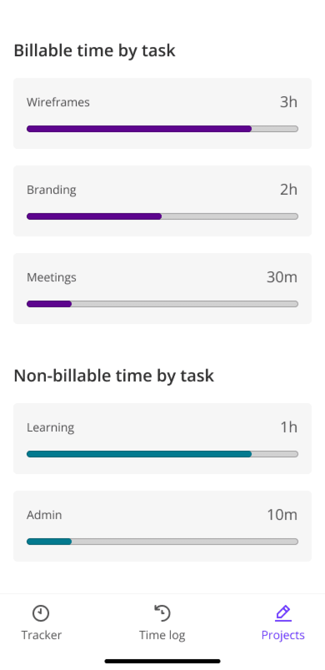
the projects
Translating time to money for the freelancer
I designed screens and flows for users to view their projects and amounts to bill. I sketched different layouts of this screen to help me understand the architecture of accomplishing tasks (e.g. should users also be able to see their log here?).
The main goals for this screen are:
viewing payment information
viewing billable/non-billable time
adding/editing projects
ensuring unassigned entries are assigned to projects
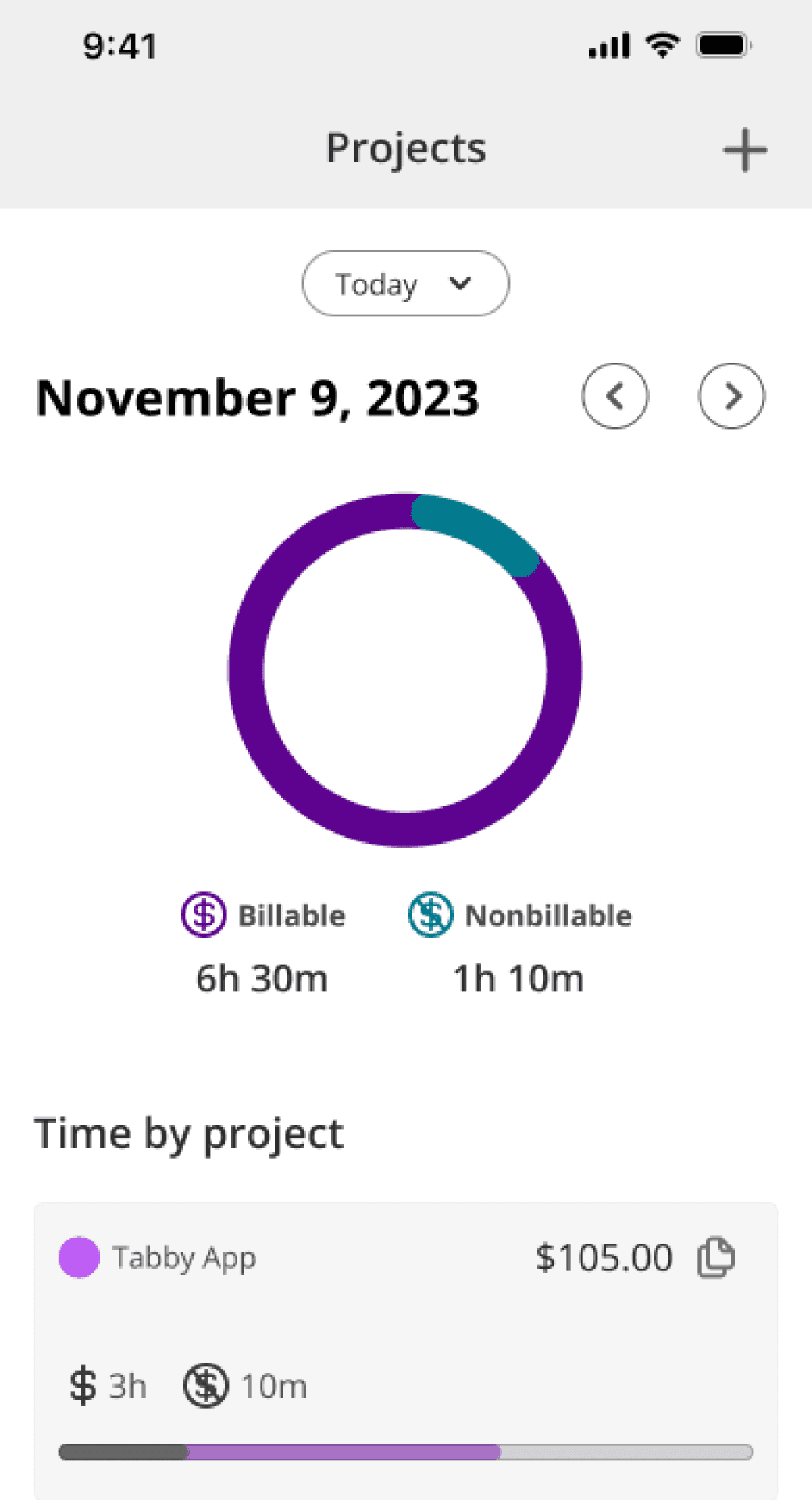
Sketches of the projects screen layout

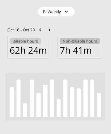
Medium fidelity layouts of project data visualizations


Prototype + test
Getting an early prototype in front of freelancers to test structure and main flows
I made a medium fidelity prototype with most of the basic tasks and screens built into it. I wanted to test the concept at this stage to see if the structure, architecture, and layout of screens were intuitive and navigable.
I conducted moderated remote usability tests with 5 freelancers. I used this another opportunity to hear freelancers talk about their work and workflows. Would this tool be desirable and valuable for them?
Prototype + test

Usability testing
Most tasks were easy to complete, with definite room for improvement to simplify the design
The usability test research objectives were:
To evaluate the architecture, structure, and flow of MVP features
To describe user understanding of how much of their time was spent on a project and on a task
To understand the value of the MVP to freelancers
I created a scorecard for each of the tasks on a 1-3 Likert scale to allow me to score tasks and find trends quickly. This also freed up my attention to probe deeper into specific actions during tests.
Most tasks were easy to complete, but there were moments where participants hesitated or tapped around.
Revision 1
Improve affordances with the tracker
Revision 2
Incorporate alerts or notifications for unassigned time entries
Revision 3
Improve content organization and hierarchy to prioritize main jobs
Revisions
Fixing affordances, showing errors, and cleaning up clutter to help freelancers capture time
revisions
Revision 1: the tracker
Improving affordances with the initial timer screen to highlight the primary action
In testing, most participants wanted to enter the project and task information to get started. It would be an unnecessary. In order to make getting started more efficient, I removed the project, task, and billable inputs. This highlighted the primary action more.
Tested version

Poor affordances
Most users wanted to enter information into the fields, but it was unnecessary. The tracker detects the application type and file name and associates it with already inputted projects.
Iterated version

A clearer primary action
Removed the fields and toggle to better show what the first action should be on the screen. Start tracking and the app will do the rest.
Final version

Differentiating page and supporting workflows
This feature visually mimics focus while the freelancer is working. It intentionally looks different from the other screens.
Revision 2: Time log
Adding bold, alerting visuals to help freelancers recognize errors
During testing, 3/5 participants had difficulty finding the unassigned time entries. If these were not assigned to projects, then the freelancer wouldn’t get paid. I tried a few versions of notifications to the user, and eventually opted for a highly visible alert that would be added to the time log and tracker.
Tested version

Finding unassigned entries
During testing 3/5 of participants had difficulty finding the unassigned entry. It blended in too well with other entries. The consequence for leaving an entry unassigned was not getting paid for that time.
Iterated version

Trying a subtle notification
I tried a version with a notification bell, following common design patterns. I found that it was too subtle and too easy to ignore.
Final version

Highly visible alert
I opted for more visible alert that users could tap through to see all of the unassigned entries. Bringing more attention here was imperative for freelancers to get paid.
Revision 3: projects
Improving hierarchy and reducing clutter to prioritize the paycheck
The projects screen is where users would check to see how much money to bill for and how long tasks would take. Participants were able to complete the task of understanding how much to bill for and how long a project task took. I could make it even easier by giving the project cards better placement, toward the top of the screen. I also made it easier for users to consume the pie charts in their mobile viewports.
Tested version
Over prioritized pie
The main task on this page is finding out payment amount for projects. Participants looked to the project cards right away, and ignored the pie chart.
Final version
Increased project card hierarchy
I moved the project cards to the top of the screen. This would be the most important task for the freelancer when going to this screen.
Tested version
An overwhelming list
This list of tasks could easily become more overwhelming with the more tasks the freelancer does during the selected time period.
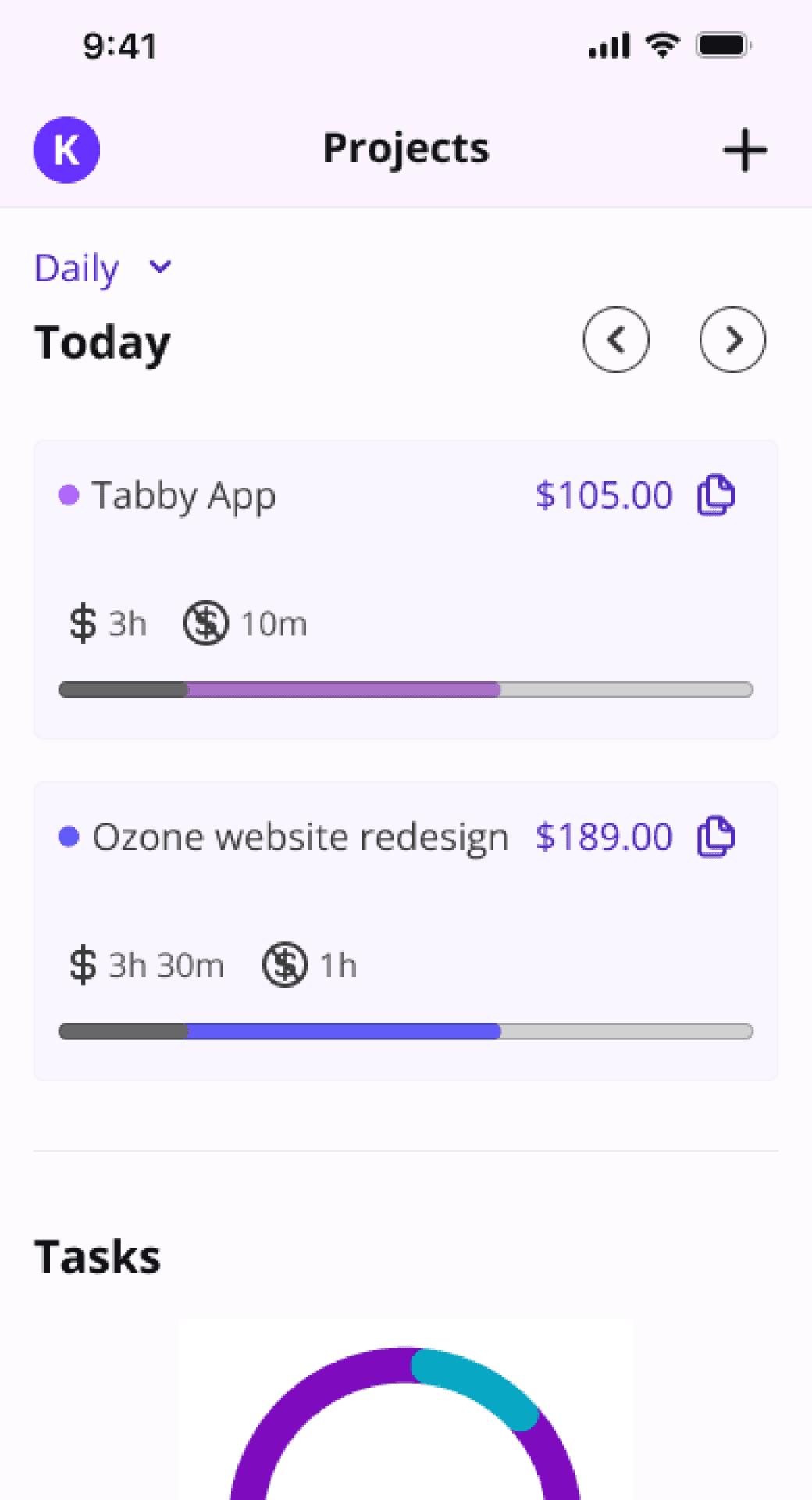
Final version
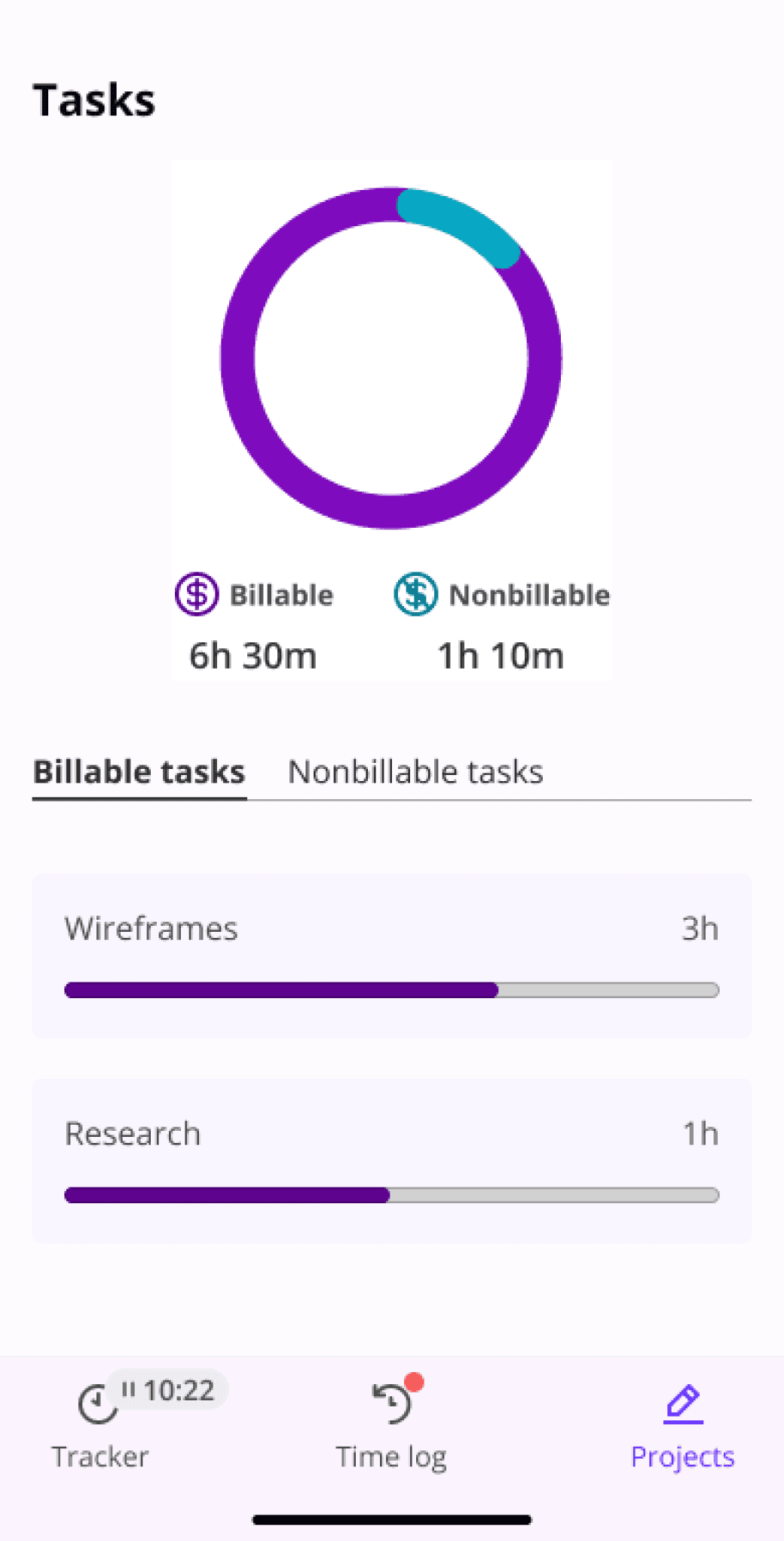
Better information grouping and more disclosure
I grouped the pie chart and the tasks cards together for easier viewing in the viewport. I separated groups into tabs to make the data feel less overwhelming.
Branding and ui kit
Finding flow, supporting autonomy
The brand direction follows the values of being a freelancer: flow, autonomy, flexibility, and clarity.
The color palette is monochromatic for high contrast to primary actions and customizations. The primary brand colors are flow purple and free pink.
The logo is simple and reminiscent of a clock and a play button.


from chaos to efficiency
A way for freelancers to feel less dread about time tracking
Usability test participants rated their current method for time tracking as 2.7. They rated mobile app as a 4.6. With just a prototype and without any functionality, this score holds little weight.
When probing deeper into their responses, I learned of possible uses cases, edge cases, and what freelancers value about the proposed solution.
Feeling less dread about time tracking
Efficiency while working
Adjusting workflow based on trends
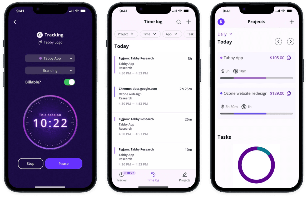
Final Screens
Tracker


Time log


Projects


WHAT’S NEXT?
Mapping out the freelancer workflow to design for more use cases and edge cases
I designed for the workflows that I found during generative research, which were fairly broad and covered a typical work day that the freelancer recalled. To make a better app for the ideal user, I would next want to further map out the freelancer workflow and how they would interact with the app while they work.
WHAT’S NEXT?
WHAT I LEARNED
Understanding the user context to get to an ideal outcome
By clearly defining the problem and the user context, I was able to focus on an ideal outcome for the user. This made it simpler to prioritize the most important features to design for this end-to-end MVP app and allowed me to zoom in more on the details of the UI and interaction design. Each feature included had to be absolutely necessary for accomplishing the job to be done for this particular user group and building for greater impact.
WHAT I LEARNED

